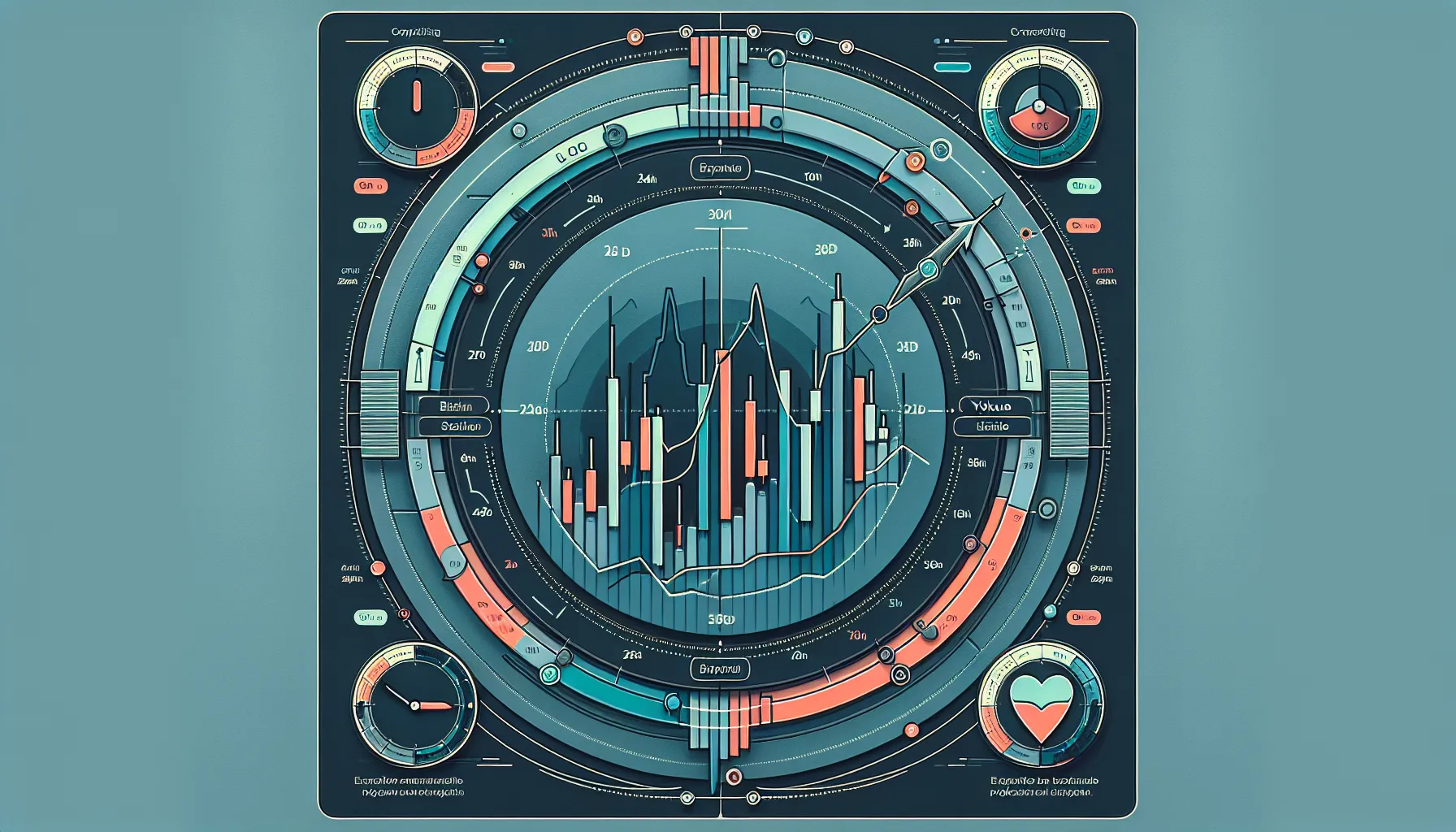
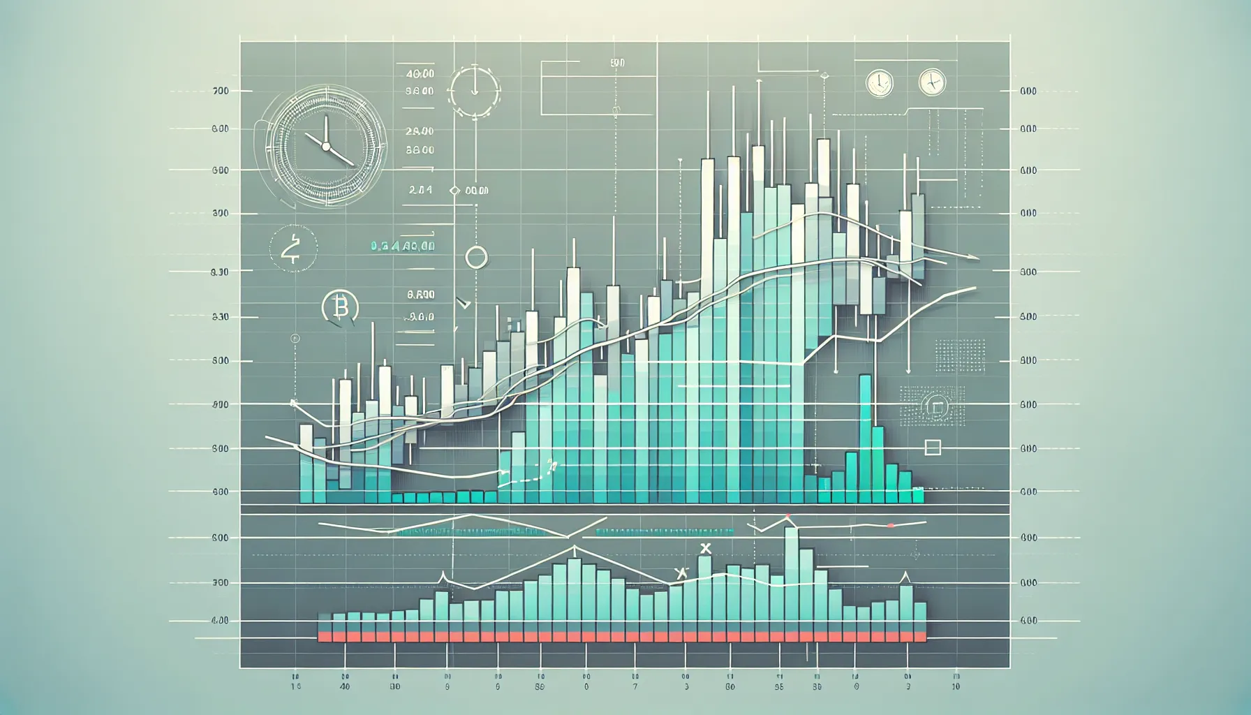
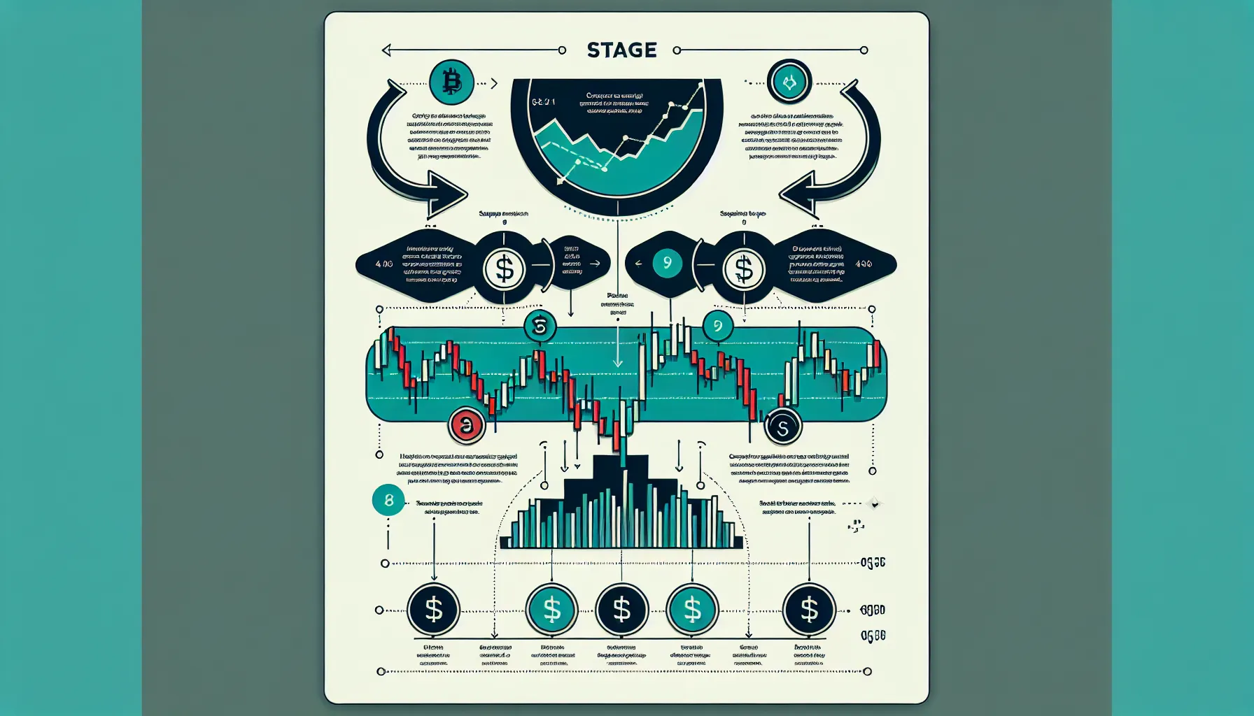
Navigating the world of cryptocurrency trading can feel overwhelming, especially when faced with the colourful, fluctuating charts that dominate trading platforms. Yet these visual tools, crypto price charts, are far more than intimidating graphs. They’re the trader’s compass, revealing price movements, trends, and opportunities hidden within the market’s chaos. Whether someone is a curious beginner or an investor looking to refine their strategy, learning to read these charts is a critical skill that transforms speculation into well-informed choice-making.
Crypto price charts display the price action and trading volume of digital assets over time, capturing the heartbeat of the market in real-time. They enable traders to spot trends, gauge market sentiment, and identify key entry and exit points. But charts aren’t just for day traders, they matter for long-term investors too, offering insight into broader market cycles and helping to time purchases or sales more strategically. This guide breaks down the essentials of reading and understanding crypto price charts, from basic components to advanced patterns, so anyone can confidently interpret what the market is saying.
Key Takeaways
- Crypto price charts are visual tools that display price movements and trading volume, helping traders identify trends, market sentiment, and optimal entry and exit points.
- Candlestick charts are the most popular format, showing opening, closing, high, and low prices in a visually intuitive way that reveals market psychology.
- Volume bars confirm the strength of price movements—high volume during a breakout validates the move, whilst low volume may signal a false signal.
- Support and resistance levels act as psychological barriers where buying or selling pressure historically concentrates, guiding strategic trade decisions.
- Recognising chart patterns such as head and shoulders, triangles, and candlestick formations like hammers or dojis improves the ability to predict potential reversals or continuations.
- Trading with the trend—uptrends, downtrends, or sideways movement—dramatically increases success rates and reduces the risk of costly mistakes.
What Are Crypto Price Charts and Why Do They Matter?

At their core, crypto price charts are visual representations of how a digital asset’s price has moved over a specific period. They plot price against time, creating a historical record that traders can analyse to forecast future movements. Most charts also display volume, the amount of the asset traded during each interval, which adds another layer of insight into market activity.
Why do these charts matter so much? Because they turn abstract market data into something tangible and actionable. A trader looking at Bitcoin’s chart over the past 24 hours can quickly see whether the price is climbing, falling, or moving sideways. More importantly, they can spot patterns, anomalies, and signals that suggest what might happen next. For short-term traders, charts are indispensable for timing entries and exits. For long-term investors, they reveal macro trends, like whether an asset is in a prolonged uptrend or a corrective phase.
Beyond individual decision-making, price charts reflect collective market sentiment. A sharp upward spike often signals enthusiasm or FOMO (fear of missing out), while a sudden drop might indicate panic or profit-taking. Understanding these dynamics helps traders remain objective and avoid emotional reactions. In essence, crypto price charts are the language of the market, and learning to read them is the first step towards fluency.
Essential Components of Crypto Price Charts

Before diving into chart types or patterns, it’s crucial to understand the fundamental building blocks that every crypto chart shares. These components form the skeleton of any price chart, whether it’s a simple line graph or a complex candlestick display.
Understanding Price Axes and Time Frames
Every chart features two axes: the vertical axis (or price axis) and the horizontal axis (or time axis). The vertical axis displays the price levels of the asset, ranging from the lowest to the highest price visible within the selected period. The horizontal axis represents time, segmented into intervals that can range from one minute to one month or longer.
Choosing the right timeframe is pivotal. A one-hour chart is ideal for day traders seeking quick moves, while a daily or weekly chart suits swing traders and long-term investors analysing broader trends. Shorter timeframes reveal more noise and volatility, whereas longer ones smooth out fluctuations and highlight sustained trends. A trader might use multiple timeframes simultaneously, checking a daily chart for the overall trend and then zooming into a 15-minute chart to time a precise entry.
Volume Bars and Their Significance
Beneath most price charts, coloured bars rise and fall in tandem with the price action. These are volume bars, and they indicate the number of assets traded during each time interval. Volume is one of the most underrated yet powerful indicators on any chart.
High volume during a price increase suggests strong buying interest and confirms the move’s strength. Conversely, a price rise on low volume may be weak and unsustainable, a potential false breakout. Similarly, high volume during a decline signals aggressive selling, while low volume could mean the drop lacks conviction. Experienced traders always cross-check price movements with volume to gauge the reliability of a trend. When price and volume align, the signal is much more trustworthy.
Types of Crypto Price Charts Explained
Not all charts are created equal. Different chart types display price data in unique ways, each offering distinct advantages depending on the trader’s goals and experience level.
Line Charts: The Simplest View
Line charts are the most basic form of price visualisation. They plot a single data point, usually the closing price, for each time interval and connect these points with a continuous line. The result is a smooth, easy-to-read curve that shows the general direction of price movement over time.
Line charts excel at providing a clean, long-term overview. They’re perfect for beginners who want to grasp an asset’s overall trajectory without getting bogged down in detail. But, they lack granularity. Because they only show closing prices, traders miss out on the highs, lows, and intra-period volatility, information that can be crucial for making informed decisions. For serious analysis, line charts are rarely sufficient on their own.
Candlestick Charts: Reading Market Sentiment
Candlestick charts are the gold standard in crypto trading and the most widely used format on exchanges and trading platforms. Each candlestick represents a specific time interval and displays four key prices: the open, high, low, and close (OHLC).
The candlestick’s body shows the range between the opening and closing prices. If the close is higher than the open, the body is typically coloured green (or white), indicating a bullish period. If the close is lower, the body is red (or black), signalling bearish sentiment. The thin lines extending above and below the body, called wicks or shadows, represent the highest and lowest prices reached during that interval.
This rich visual information makes candlestick charts incredibly expressive. At a glance, a trader can assess whether buyers or sellers dominated a particular period, how volatile the price was, and whether there were any sharp rejections at certain levels. Candlesticks also form recognisable patterns that signal potential reversals or continuations, a skill traders develop over time.
Bar Charts: An Alternative Perspective
Bar charts, sometimes called OHLC charts, convey the same information as candlesticks but in a different format. Each bar consists of a vertical line representing the high and low prices, with small horizontal ticks on either side: the left tick marks the opening price, and the right tick marks the closing price.
Whilst bar charts offer the same data as candlesticks, they’re less visually intuitive. The colour-coded bodies of candlesticks make it easier to spot bullish or bearish movements at a glance. But, some traditional traders prefer bar charts for their simplicity and lack of visual “noise.” In the crypto space, though, candlestick charts have become the dominant choice due to their clarity and expressiveness.
How to Read Candlestick Patterns for Beginners
Once a trader understands the structure of a candlestick, the next step is recognising patterns, specific formations that suggest what the market might do next. Candlestick patterns are born from centuries of trading tradition, and many have proven remarkably reliable across different markets, including crypto.
A bullish candle (green or white) closes higher than it opened, showing that buyers gained control during that period. A bearish candle (red or black) closes lower, indicating sellers dominated. But things get interesting when candlesticks form specific shapes or sequences.
The Doji is a candlestick with a very small body, meaning the open and close prices are nearly identical. It signals indecision, neither buyers nor sellers have a clear advantage. A Doji appearing after a strong trend often hints at a potential reversal.
An engulfing pattern occurs when a large candlestick completely engulfs the previous one. A bullish engulfing pattern (a large green candle following a smaller red one) suggests a shift in momentum towards buyers. A bearish engulfing (a large red candle after a smaller green one) indicates sellers are taking over.
The hammer is a bullish reversal pattern featuring a small body at the top and a long lower wick, showing that buyers stepped in after a price drop. Conversely, a shooting star has a small body at the bottom with a long upper wick, signalling that sellers rejected higher prices, often a bearish reversal signal.
For beginners, mastering just a handful of these patterns can dramatically improve chart-reading skills. The key is patience: patterns are more reliable when they appear at significant support or resistance levels and are confirmed by subsequent price action or volume spikes.
Identifying Support and Resistance Levels
Support and resistance are two of the most fundamental concepts in technical analysis. They represent price levels where the market has historically shown strong buying or selling pressure, and they often act as psychological barriers.
Support is a price level where buying interest is strong enough to prevent the price from falling further. Imagine a floor beneath the price, when the asset approaches this level, buyers tend to step in, pushing the price back up. Support is typically identified by looking at previous lows where the price bounced multiple times.
Resistance works in the opposite way. It’s a price level where selling pressure is strong enough to halt or reverse upward momentum. Think of it as a ceiling, when the price nears resistance, sellers often take profits or open short positions, causing the price to retreat. Resistance is found by examining historical peaks where the price struggled to break through.
Identifying these levels is both an art and a science. Traders look for areas where the price has reversed direction multiple times, as repetition strengthens the significance of a level. Horizontal lines drawn at these points help visualise support and resistance zones.
What makes these levels particularly powerful is their tendency to flip roles. A broken resistance level often becomes new support (and vice versa), a phenomenon known as a “role reversal.” For example, if Bitcoin breaks above £30,000 after months of resistance, that level may then act as support on future pullbacks.
Traders use support and resistance to plan entries, exits, and stop-loss orders. Buying near support and selling near resistance is a time-tested strategy, though it’s crucial to confirm these levels with volume and other indicators before acting.
Common Chart Patterns Every Trader Should Recognise
Beyond individual candlesticks, price action often forms larger patterns over days or weeks. These chart patterns are visual formations that signal potential trend reversals or continuations, and recognising them can provide a significant edge.
Reversal patterns suggest that the current trend is losing steam and may reverse direction. The head and shoulders pattern is one of the most reliable bearish reversal signals. It consists of three peaks: a higher peak (the head) flanked by two lower peaks (the shoulders). When the price breaks below the “neckline” (a support level connecting the lows between the peaks), it often signals a strong downward move.
The inverse, an inverse head and shoulders, is a bullish reversal pattern indicating that a downtrend may be ending. Similarly, double tops and double bottoms are reversal patterns where the price tests a high or low twice before reversing direction.
Continuation patterns, on the other hand, suggest that the prevailing trend will resume after a brief pause. Triangles, ascending, descending, or symmetrical, are among the most common. They form when the price consolidates within converging trendlines. A breakout from the triangle typically continues in the direction of the prior trend.
Flags and pennants are short-term continuation patterns that resemble small rectangles or triangles. They occur after a sharp price move and represent a brief consolidation before the trend resumes. These patterns are popular among day traders because they often lead to quick, predictable moves.
Recognising patterns takes practice. Traders often combine pattern recognition with volume analysis and indicators to confirm signals. And it’s important to remember: patterns aren’t foolproof. They increase the probability of a certain outcome but never guarantee it. Risk management remains essential.
Understanding Trends: Uptrends, Downtrends, and Sideways Movement
“The trend is your friend”, this old trading adage remains as true in crypto markets as anywhere else. Understanding the direction of the trend is arguably the most important skill for any trader, because trading with the trend dramatically improves success rates.
An uptrend is characterised by a series of higher highs and higher lows. Each peak is higher than the previous one, and each pullback (or correction) stops at a higher level than the last. This pattern signals that buyers are in control and that demand is consistently outpacing supply. Traders look to enter long positions during uptrends, ideally buying during pullbacks to support levels.
A downtrend is the opposite: a sequence of lower highs and lower lows. Each rally fails at a lower level than the previous one, and each decline reaches a new low. Downtrends indicate that sellers dominate and that supply exceeds demand. In a downtrend, traders might look for short-selling opportunities or simply stay on the sidelines to preserve capital.
Sideways movement, also called consolidation or a ranging market, occurs when the price oscillates within a horizontal band, bouncing between support and resistance without making significant progress in either direction. Ranging markets can frustrate trend-following traders but offer opportunities for range traders who buy near support and sell near resistance.
Identifying the trend is often done by drawing trendlines, diagonal lines connecting successive highs (in a downtrend) or lows (in an uptrend). Breaking a trendline can signal a potential trend reversal. Combining trendlines with moving averages or other indicators strengthens trend analysis and reduces false signals.
Successful traders align their strategies with the prevailing trend. Fighting the trend, trying to pick tops or bottoms prematurely, is one of the quickest ways to lose money in volatile crypto markets.
Practical Tips for Analysing Crypto Charts Effectively
Reading charts is one thing: analysing them effectively is another. Here are practical tips to help traders move from theory to confident execution.
Start with the right chart type and timeframe. For most beginners, candlestick charts on a daily timeframe offer the best balance of detail and clarity. Once comfortable, they can explore shorter timeframes for active trading or longer ones for strategic planning.
Use volume to confirm price moves. Never trust a breakout or reversal without checking the volume. Strong volume validates the move: weak volume raises a red flag. Volume should be a constant companion in chart analysis.
Identify key support and resistance levels early. Before placing any trade, mark the significant levels on the chart. These act as decision points, places where the trader will reassess their position or adjust their stop-loss.
Recognise the trend direction before trading. Ask: is the market trending up, down, or sideways? Align trades with the trend whenever possible, and be extra cautious when trying to trade reversals.
Layer on one or two technical indicators. Indicators like the Relative Strength Index (RSI) or Moving Average Convergence Divergence (MACD) can add confirmation to chart patterns. But don’t overload the chart, too many indicators create confusion rather than clarity.
Practise sound risk management. Even the best chart analysis can be wrong. Always use stop-loss orders to limit potential losses, and never risk more than a small percentage of capital on a single trade. Emotional discipline is just as important as technical skill.
Keep a trading journal. Recording trades, what the chart showed, why the trade was taken, and the outcome, builds experience faster than anything else. Over time, patterns in decision-making emerge, helping traders refine their approach.
Finally, remember that chart reading is a skill honed through repetition. The more time spent observing price action, the more intuitive the process becomes. There’s no substitute for screen time.
Conclusion
Learning to read and understand crypto price charts is not an overnight achievement, but it’s far from an insurmountable challenge. With a grasp of the essential components, price axes, timeframes, volume, and chart types, anyone can begin to decode the visual language of the market. From there, recognising candlestick patterns, identifying support and resistance, spotting larger chart formations, and understanding trends gradually transform raw data into actionable insights.
Charts are more than lines and colours on a screen. They’re a window into market psychology, reflecting the collective decisions of thousands of traders. By learning to interpret these signals, traders gain a significant edge, whether they’re aiming for short-term profits or long-term growth. The key is consistency: regular practice, disciplined analysis, and a willingness to learn from both successes and mistakes.
For those just starting, the best advice is simple, pick a chart, start observing, and don’t be afraid to make mistakes in a low-risk environment. Over time, the patterns will start to make sense, the noise will fade, and the market’s story will become clearer. The journey from confusion to confidence is entirely achievable, one chart at a time.
Frequently Asked Questions
How do you read crypto price charts for beginners?
Start with candlestick charts on a daily timeframe to balance detail and clarity. Learn to identify the four key prices—open, high, low, and close—and observe volume bars to confirm price movements. Focus on recognising basic trends and key support and resistance levels before progressing to patterns.
What is the difference between support and resistance levels on crypto charts?
Support is a price level where strong buying interest prevents further decline, acting like a floor. Resistance is where selling pressure halts upward movement, functioning as a ceiling. These levels often flip roles after being broken—resistance becomes support and vice versa.
Why is volume important when analysing crypto price charts?
Volume indicates the strength behind price movements. High volume during a price increase confirms strong buying interest, whilst low volume suggests a weak or unsustainable move. Always cross-check price action with volume to validate trends and avoid false breakouts.
What timeframe is best for reading crypto charts?
The ideal timeframe depends on your trading style. Day traders use one-hour or 15-minute charts for quick moves, whilst swing traders prefer daily charts. Long-term investors analyse weekly or monthly charts to identify broader market cycles and reduce noise.
Can you predict crypto prices accurately using chart patterns?
Chart patterns increase the probability of certain outcomes but cannot guarantee predictions. Patterns like head and shoulders or triangles suggest potential reversals or continuations. Combining patterns with volume analysis and indicators improves reliability, but risk management remains essential.
What are candlestick wicks and what do they tell traders?
Candlestick wicks, or shadows, are thin lines extending above and below the candle body. They show the highest and lowest prices during that period. Long wicks indicate price rejection at those levels, revealing where buyers or sellers stepped in aggressively.


